UI Design
Redesigning the digital communication platform of a beautiful initiative for our future.
This project is part of a personal initiative, on the one hand to deepen the processes and needs of UX/UI Design.
My Role
Wireframing, Prototyping, Information Arquitecture, Interaction Design, Brand Design.
Personal Project
Platforms
Desktop
Year
2022
Duration
15 days
About the Project
To do so, they attend events and give conferences, but it is just as important that their main channel of communication with the world highlights the value of their work and builds an image as unique as the project itself.
UX Challenges
Therefore, it fulfills two main objectives for two main types of users: those who want to contribute financially and those who want to get involved with actions.
There was a big dichotomy in the way the site was presented: the work had to look serious, answer many questions and have all the historical, current and future path details, while at the same time inspire and excite those interested in the project.
UX Solutions
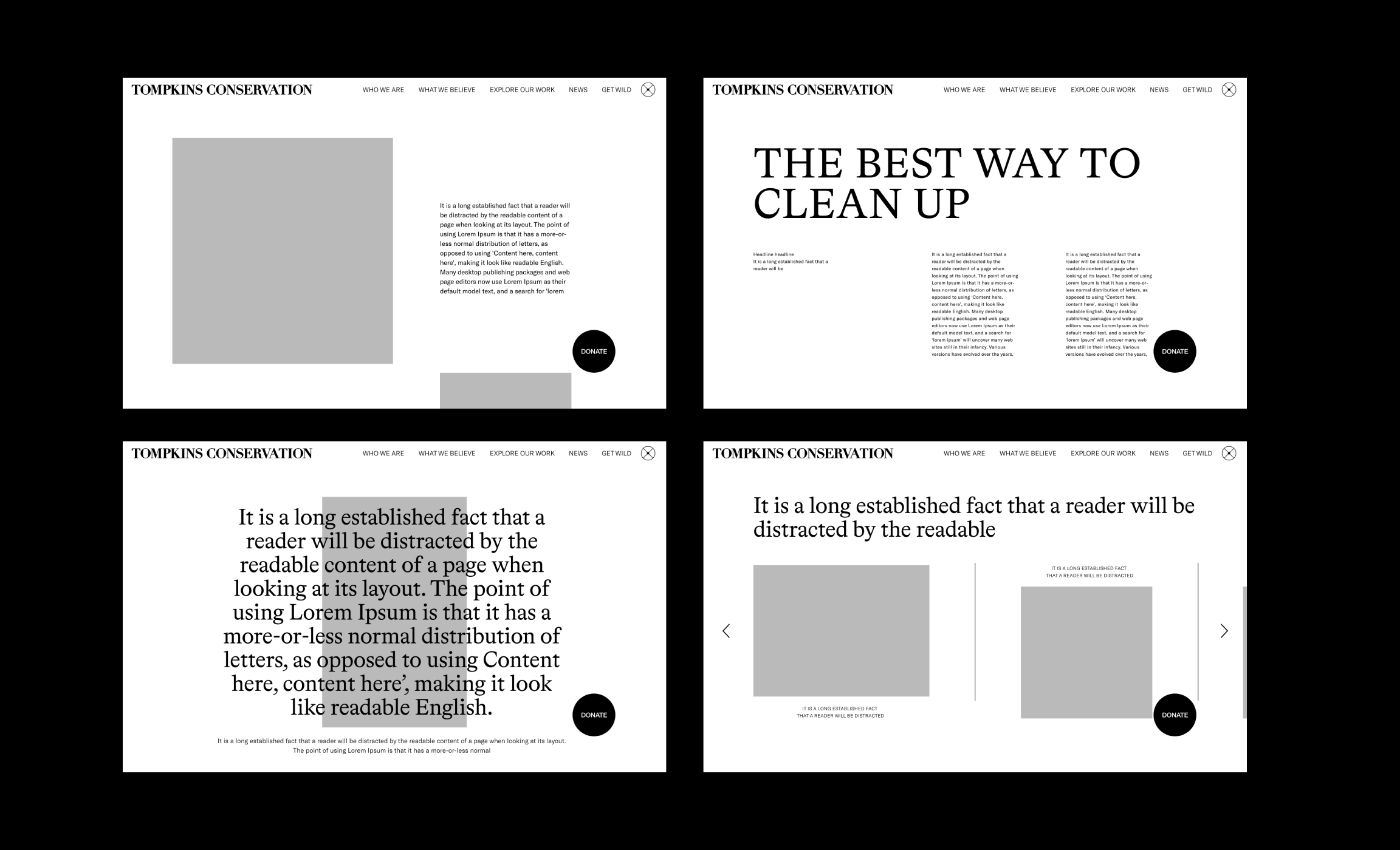
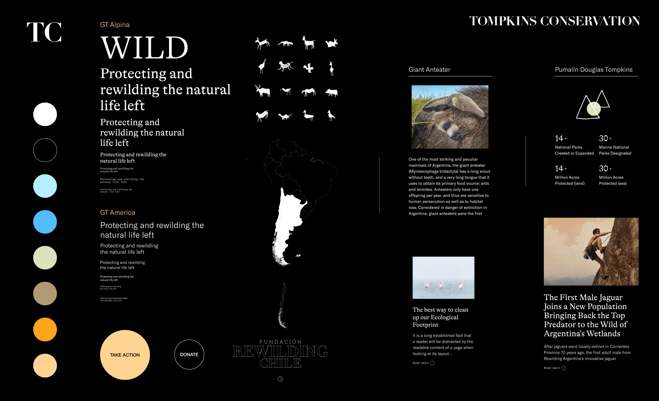
To meet the challenge of the amount of information, create a narrative architecture based on how editorial products are consumed, so that clear and concise messages guide navigation. In the background, but not discreetly, are always present the buttons that direct us to donate or take action.
To balance the weight of the theme and the volume of information, the page designs use beautiful images of the main characters, nature and animals that, lying on a dark black background, captivate our attention and lead us to a deeper immersion in the communication.
Introducing our history and our work in a dynamic and interactive way.
At any time of navigation to facilitate the decision to collaborate with the cause.
Other digital projects
 Magnetü ︎︎︎